
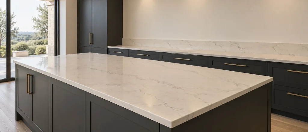
Choosing a worktop colour is about more than finding a sample you like. That surface needs to work across the kitchen, from the island to the sink run, while sitting comfortably beside cabinets, flooring and splashbacks. A consistent background colour can make those decisions easier.
Engineered quartz offers a useful degree of colour repeatability, helping separate surfaces feel connected. It still needs thoughtful selection, particularly with veined designs. Understanding what consistency means, and what to check before fabrication, helps you build a kitchen that feels considered rather than simply matched.
What colour consistency actually means in quartz
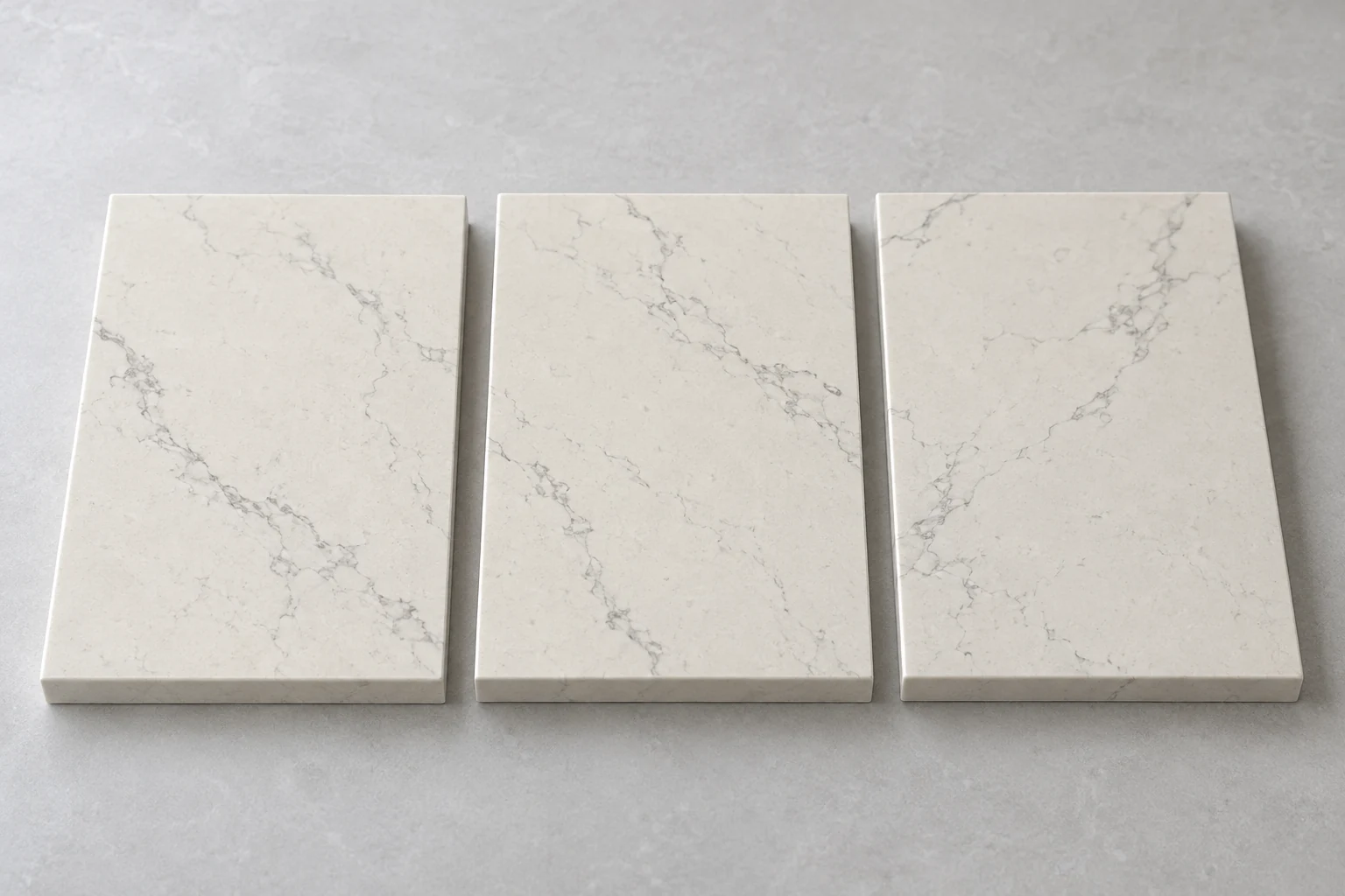
Quartz is manufactured to defined designs, which helps make its overall colour and character more repeatable. For kitchen planning, this gives you a dependable starting point: a chosen surface can provide a shared background tone across several worktop areas.
Consistency does not mean every slab is identical. There can be variation between production batches, and designs with movement or veining may differ across individual slabs. A small sample shows the general character, but it cannot reveal every detail of a larger surface.
It helps to separate three things when assessing quartz kitchen worktops:
- Background colour: the main tone that connects the worktop with surrounding materials.
- Pattern: the size, spacing and direction of veins, flecks or other details.
- Finish: the surface texture and sheen, which affect how light is reflected.
Two pieces can share a background colour without having identical patterns. Recognising that distinction helps you decide whether your priority is an even overall palette, flowing movement or a balance of both.
Use a shared surface to connect islands and worktop runs
An island and a perimeter worktop are often viewed together, even when they serve different purposes. Repeating the same quartz design creates a visual link between them, particularly when the cabinetry differs in colour or finish.
This does not require every kitchen element to match. A shared worktop can give you more freedom elsewhere. You might choose contrasting island cabinets, for example, while keeping the horizontal surfaces consistent so the room still feels connected.
Pay attention to the amount of surface on show. A broad island exposes much more of a design than a narrow run beside a sink. Veining that feels subtle on a sample may become a stronger feature across the island, while the same design appears quieter along the wall.
When exploring Compac quartz, consider how the design will read at both scales. Ask to see a larger representation or the proposed slabs where possible, rather than relying on a small sample alone.
If you prefer different worktop designs for the island and perimeter, compare their undertones carefully. A deliberate contrast usually works better than two pale surfaces that almost match.
Coordinate splashbacks, cabinets and flooring by undertone
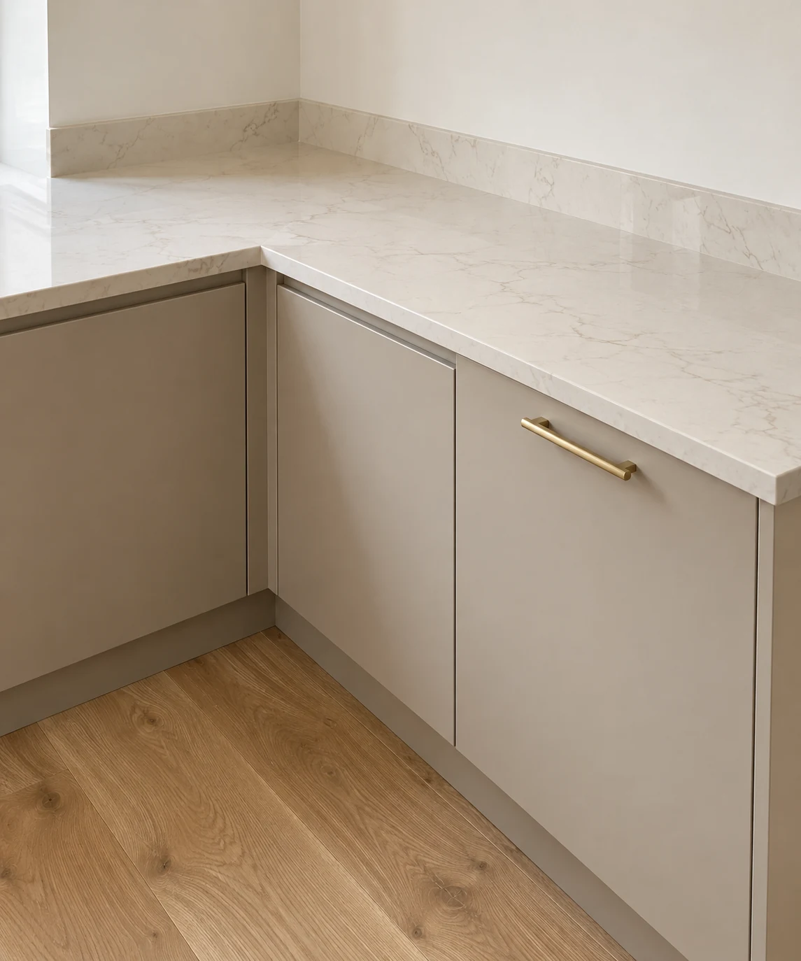
A repeatable quartz colour provides a useful reference for the other permanent finishes in your kitchen. Start with its undertone rather than its colour name. Surfaces described as white, cream or grey can lean warmer or cooler, and that difference becomes clearer beside other materials.
Place your quartz sample directly against cabinet, splashback and flooring samples. Look at the background colour first, then consider whether any veins or flecks pick up tones elsewhere. You do not need to repeat every colour in the worktop.
For splashbacks, decide whether you want continuity or separation. Using the same quartz design for an upstand can connect the worktop and wall. Tiles, glass or another suitable material can introduce contrast, provided the colours sit comfortably together.
Pay particular attention to adjoining pale surfaces. A splashback that looks neutral on its own may make a worktop appear warmer or cooler when the two meet. Check grout samples too, as grout becomes part of the overall palette.
Our advice on matching worktops with flooring, cabinets and splashbacks can help you assess those relationships without making every finish identical.
Check colour under the lighting you will actually use
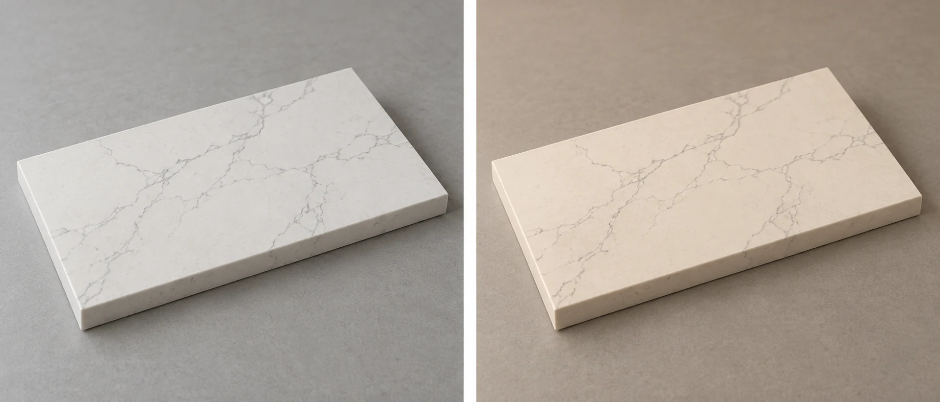
Even a consistent material can look different across a kitchen. An island receiving daylight may appear brighter than a worktop beneath wall cabinets. That difference can come from the lighting rather than a mismatch in the quartz.
Take a physical sample home where possible and move it between the proposed worktop positions. Check it during the day and after dark, with the lights you normally use switched on. Keep cabinet and splashback samples beside it so you assess the combination rather than the stone alone.
- View the sample flat, as the finished worktop will sit.
- Check it beneath cabinet lighting as well as general room lighting.
- Compare areas near windows with areas further inside the room.
- Look for reflections from nearby finishes that might influence its appearance.
If your lighting has not yet been chosen, consider it alongside the surfaces. Different lamp colour temperatures can make matching worktops appear less alike. Coordinating the lighting helps preserve the relationship between colours, while allowing separate task and dining areas to have appropriate brightness.
Plan slab allocation, joints and edges together
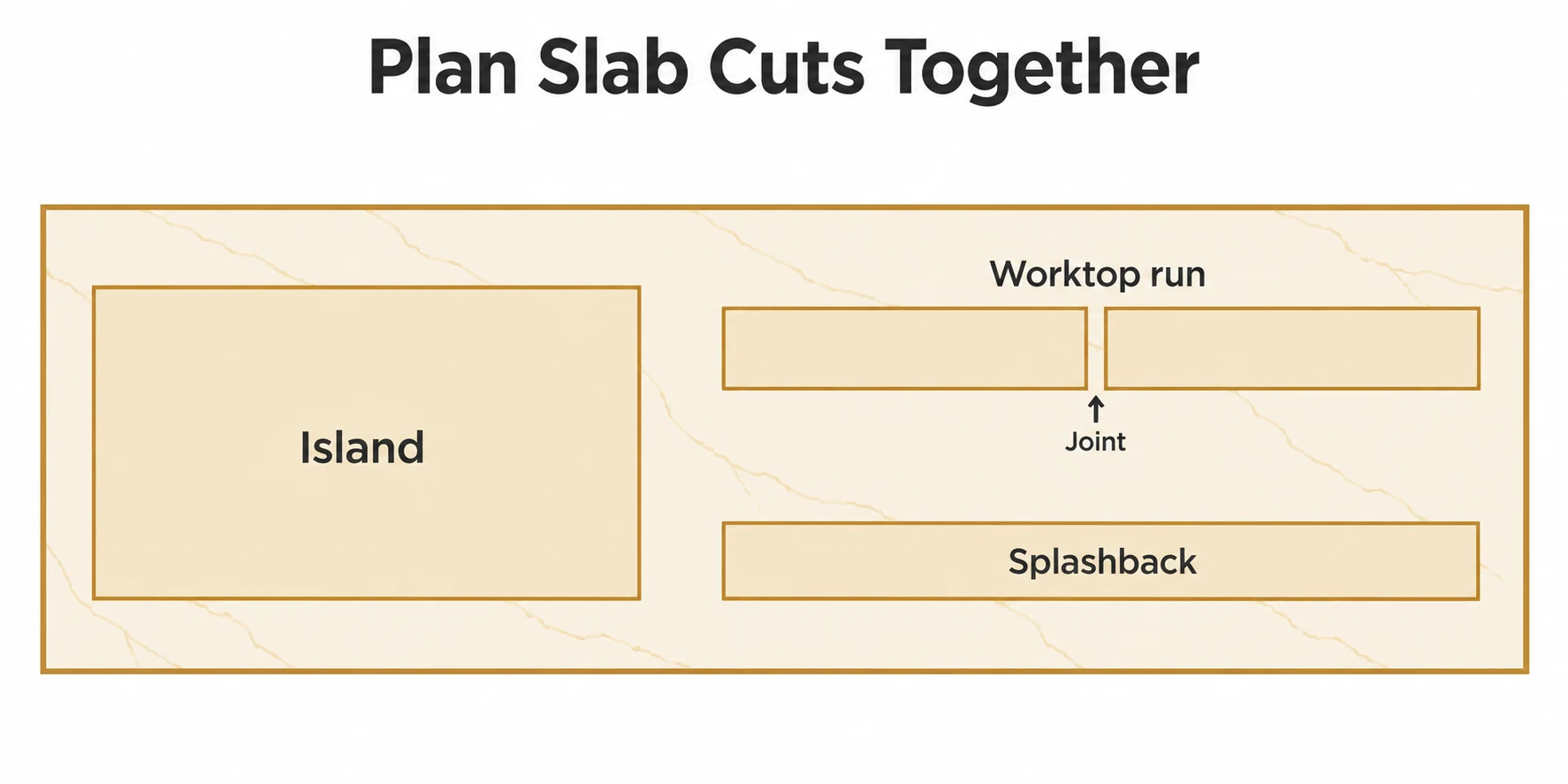
Once you have chosen a colour, the next step is deciding how the slabs will become individual worktop pieces. This matters most where several surfaces will be seen together or where a design has prominent directional veining.
Ask how material will be allocated across the island, perimeter runs and any upstands. Where possible, selecting material from the same production batch can help reduce variation, although batch matching alone does not guarantee identical appearance.
Discuss joint positions and pattern direction before fabrication. A joint joins two pieces of material, so continuous veining should not be assumed. The best layout balances appearance with slab dimensions, access, support requirements and the practical arrangement of the kitchen.
Edge details deserve attention too. The chosen profile and construction affect how the worktop colour and pattern appear along its front edge. If you want a waterfall end, ask how the pattern can relate to the horizontal surface.
Include utility worktops or other connected surfaces in the initial conversation if you want them to coordinate. Planning the full material requirement together gives the fabricator a clearer picture than adding matching pieces later.
- Quartz offers repeatable colour, but individual slabs and production batches can vary.
- Use a shared background tone to connect islands, worktop runs and surrounding finishes.
- Compare physical samples under daylight and your planned kitchen lighting.
- Discuss slab allocation, pattern direction, joints and edges before fabrication.
Frequently asked questions
Will every piece of the same quartz colour match exactly?
Not necessarily. The design provides a consistent overall character, but background tone and pattern can vary between slabs or batches. Review the proposed material where possible, especially when pieces will sit directly beside each other.
Can I use the same quartz for worktops and a splashback?
It may be suitable, subject to the chosen product, wall preparation and installation requirements. Areas near a hob need particular care. Check both the surface manufacturer’s guidance and the appliance requirements before confirming the design.
Is a plain quartz design easier to coordinate than a veined one?
A quieter design generally leaves fewer pattern relationships to consider. Veined quartz can still coordinate beautifully, but it benefits from checking larger areas of the design and planning how the movement will sit across separate pieces.
Can I add a matching quartz worktop later?
It may be possible if the design remains available, but an exact match cannot be assumed. Production batches can differ. If you already expect to add another surface, mention it during the initial planning conversation.
Bring your kitchen finishes together
If you are considering Compac quartz, speak to Stone Connection about your kitchen layout and preferred finishes. Bring your cabinet, flooring and splashback samples so we can help you consider the worktops as part of the whole design.